In MultiMailer 2012 and in earlier versions, all statistic charts were displayed in a separate window. Starting with MultiMailer 2013, the diagrams can be shown directly in the Sent Messages tab. This applies for all kinds of charts available in MultiMailer.
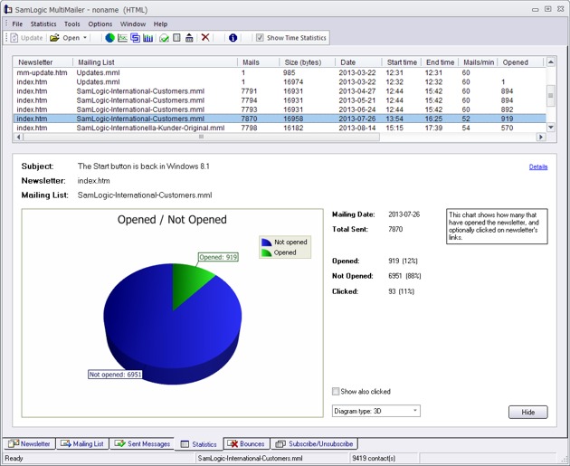
The image below shows a chart with the number of opened and unopened newsletters for an e-mail dispatch. The diagram is displayed directly in the Sent Messages tab under the list of e-mail dispatches. You just need to select a dispatch to see a chart for the particular e-mail dispatch.

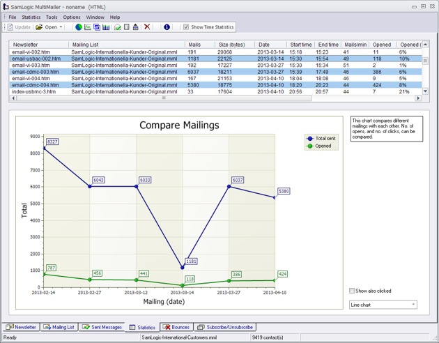
The picture below shows a chart where multiple e-mail dispatches are compared. The graphics represents the number of newsletters sent and opened for different dates.

It’s easy to choose e-mail dispatches you want to compare with each other. You just click on the chosen e-mail dispatch in the list and a new up-to-date chart appears immediately.
Just as before, you can change the chart type in the option bar at the bottom right. Similarly, you can also choose whether newsletters with links that people clicked on should appear in the diagram.
